In today's digital age, having a strong online presence is critical for any healthcare organization looking to attract and retain patients and customers. An essential component of this strategy is creating a healthcare website design that not only looks sleek and professional but also provides a user-friendly experience that meets the needs of both patients and providers. In this blog post, we’ll explore the importance of creating a healthy user experience for your healthcare website and provide tips for designing a site that leaves a lasting impression on visitors. From easy navigation to engaging content, we'll cover everything you need to know to ensure your website is a valuable tool.
Aspects of web design
Navigation systems
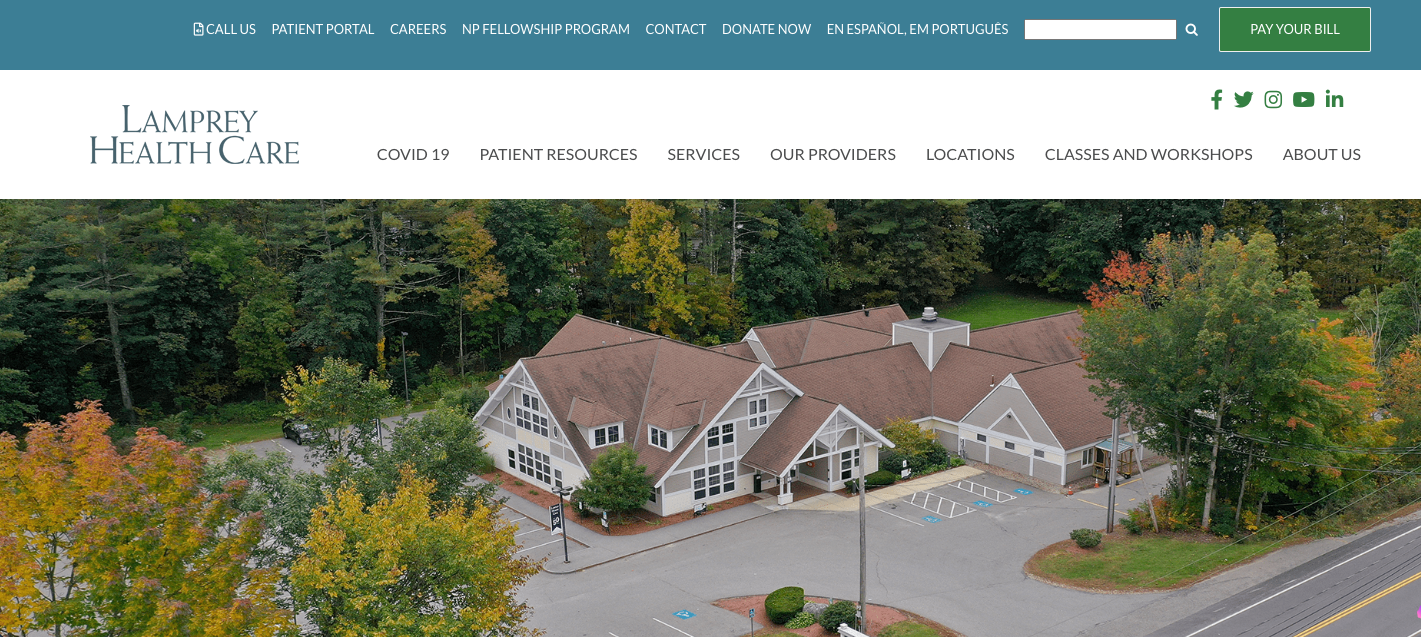
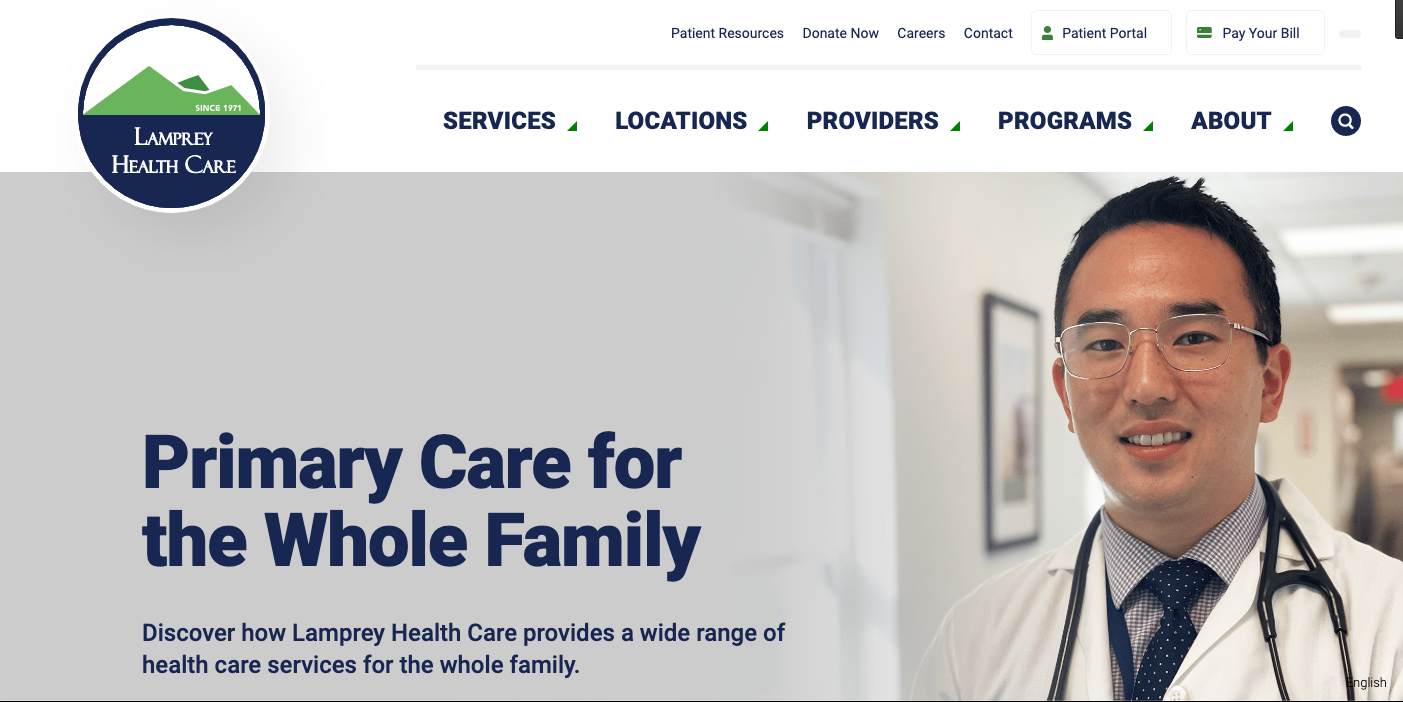
When constructing a healthcare website, you want to ensure that your patients can navigate your site with ease to find the information that they are searching for. Some websites try to cram too many tabs and icons on their top navigation menu, which may give your users a headache when trying to find their destination. With fewer options, the menu can be more accessible by using larger and distinct fonts that are easier to read and recognize. Remember, not every visitor is a Gen-Zer with sharp eyes! The National Library of Medicine reports that 33% of people ages 65 and older use healthcare websites to look up information.For example, Raka Health transformed one of our client’s convoluted navigation menus and transformed it into a more UX-friendly version.
Before:
After:
Accessibility
In addition to larger fonts, web designers can make their sites more ADA-compliant by using alt text on all images, making it more recognizable to screen readers and text-to-speech software for those with visual impairments. Businesses have flexibility and can choose how they will ensure their online content is accessible to people with disabilities, but online services provided must meet the requirements.
Content quality
Aside from being easily navigated and accessible, content is king. From blog posts on company news to information about a product or medical condition, your site should have a variety of content optimized for each subset of your audience. Not sure where to start? Create a content calendar to plan out monthly or quarterly initiatives that will keep you on track and minimize writer’s block. Ensure that your writing is understandable and not overly technical, keeping your buyer personas in mind. On the other hand, if you are a B2B healthcare site, industry vocabulary and high-level copy should be used for a professional understanding of your product. This also would include product specifications. Do your research by using tools such as Semrush to discover high-ranking keywords about healthcare topics related to your company that will boost your SEO.
If you have doctors or other professional medical providers on your team, their expertise could be invaluable in crafting new content that speaks with authority and educates your patients or customers. Just make sure they don't get bogged down in jargon – this format isn't the same as publishing in a medical journal. On a related note, don't feel as though you can only publish content focused on advice from providers. Your audience (and search results) may benefit from a variety of content focused on all the needs of your audiences, from navigating insurance to the state of the industry.
Multimedia elements
Your site should not only be informative but should feature vibrant imagery and color styles that will capture visitors’ attention. The idea of a colorful site with light imagery promotes a sense of healthiness and optimism, which is needed in the healthcare industry. The use of light colors, such as orange, purple, and yellow, is known to influence a more joyous feeling in people.Videos on your website not only captivate visitors, but can also boost metrics such as time spent on a page. These videos can be used as informational, storytelling, or behind-the-scenes. Videos can feature experts discussing different topics, product demonstrations, and many other topics that showcase your company and products.
Best practices
Website optimization
The key to a successful website is web optimization. To drive conversions and engage visitors, it needs to be easy to use and discoverable. The most important aspect of web optimization is knowing that it isn’t a one-time fix. With ongoing maintenance, your website will be in top shape and improve overall usability. With so many different website elements, how do you know what to tackle first? Start with a site performance audit, which will point out the weak spots of your website.In the audit, you’ll discover issues such as:
- Missing title tags
- Missing alt tags
- Broken internal/external links
- Crawl errors
- Site speed
To help with all your website needs, check out our Website Grader. The grader will break down your site into five categories including:
- Overall score
- Performance
- Security
- Mobile
- SEO


